Graphic Design

The Vintage Logo Collection of Reagan Ray

From the Department of Graphic Design

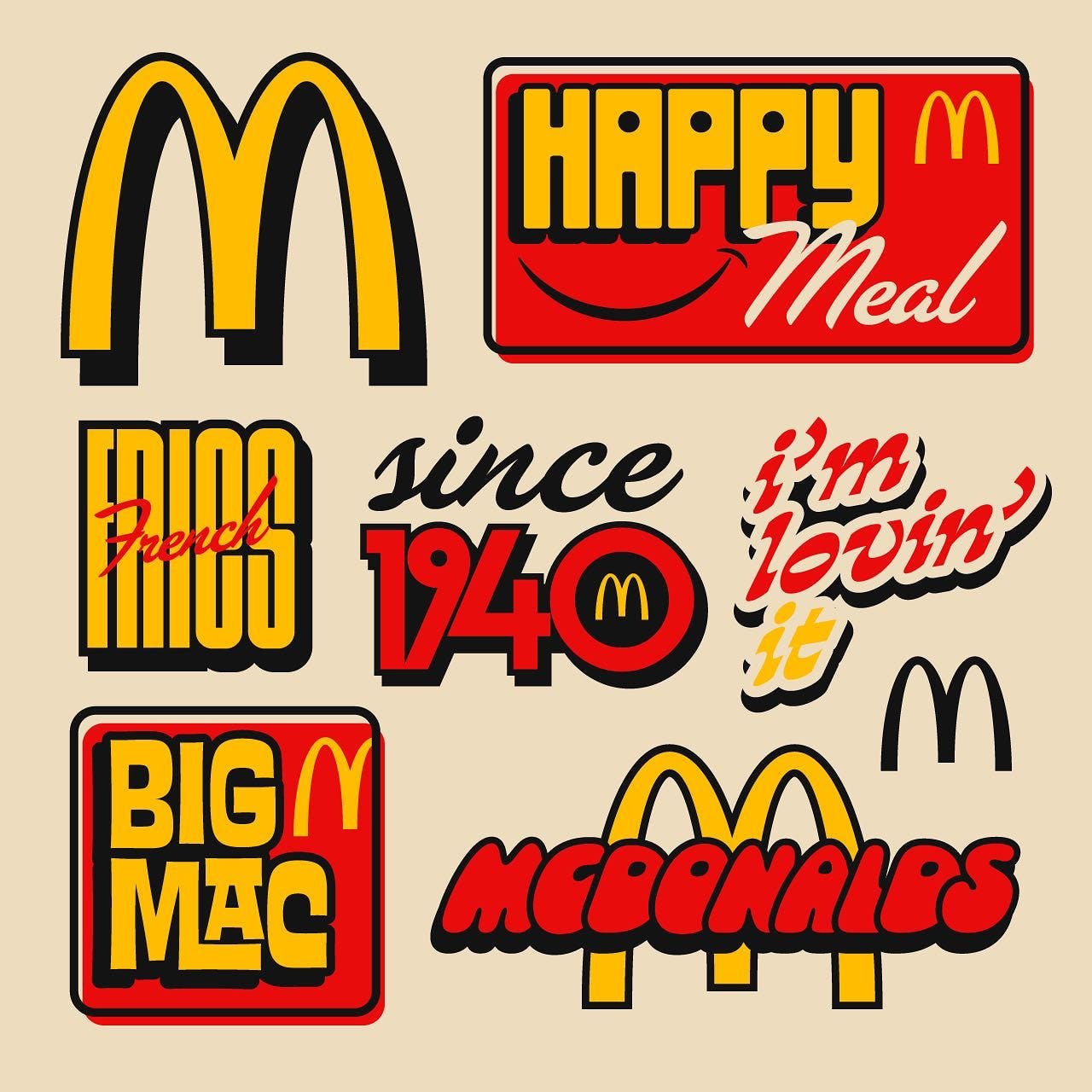
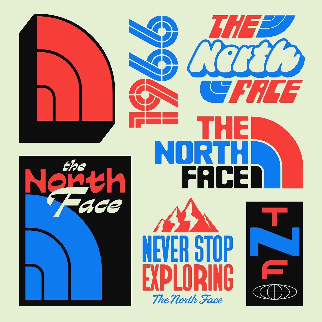
Found a nice collection of old logos put together by graphic designer Reagan Ray. This is a GOLDMINE. If you're into world building for your comic, video game, concept art, or whatever creative project you're working on, adding well thought out, appropriate logos make the world feel lived in and real.

If you're just a huge fan of graphic design in general, or an artist looking for ideas, you've got to check out Ray's website. It really is a gift.

He's collected them in different categories:

Marvel Superhero Lettering

Hair Band Lettering

Jazz Musician Lettering

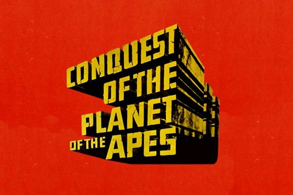
Science Fiction Movie Lettering

Las Vegas Casino Logos

Video Game Console Logos

Airline Logos

80s Action Figure Logos

American Automobile Logos

Record Label Logos

Railway Logos

VHS Distributor Logos

Western Clothing Labels

Check them out, but be careful, this is a potential day wrecker. You've been warned. I'm not responsible for any thing you didn't finish today because you got lost in logo design.

-Jake

Brett Stenson's colorful shape of nature

From the Department of Graphic Design

Brett Stenson, a Portland-based illustrator and graphic designer, has a keen eye for color and shape. His work is highly influenced by his home: the pacific north west.

I'm captivated by this artist's oeuvre. So captivated I just used a word I don't even know how to pronounce.

See more of his work here:

Website: LINK

Dribble: LINK

Instagram: LINK

-Jake​

Rafael Sarra's Logo Makeovers

​From the Department of Graphic Design

Portuguese graphic designer, Rafael Sarra asks the question: "What if this ubiquitous logo for a global brand was actually cool?" And then he goes and does something about it. Not only that he gives things logos that I didn't think needed logos, but was foolishly wrong: like Mars, and Tokyo.

Check out a boatload more of designs on his website: LINK

Instagram: LINK

and Behance: LINK

It was SO hard picking only 5 images!

-Jake

Patches from classified USAF flight test programs

From the Department of Graphic Design

When ever I'm designing a character or any sort of vehicle, including little touches like patches with interesting symbols on them just adds to the believability of the design. I'm always paying attention to those kinds of details when I'm looking at reference images.

This week I found a goldmine of interestingness: Patches from classified USAF programs. They are collected on this late 90's era website with a descriptions trying to parse out and decode the designs.

It's kind of fun to imagine what they could represent. A couple symbols of note:

5 stars surrounding 1 star: Area 51

IX XI: 9/11

Website here: LINK

A cool book about secret program patches: LINK

Article about the patches and the book: LINK

-Jake

Abstract Calligraphy

From the Department of Graphic Design

Turkey based graphic designer Fatih Hardal does some elegant work.

As an armchair graphic designer I'm always on the look out for cool and interesting approaches to lettering and these abstract calligraphy pieces fit the bill. I love seeing how the artist chose to interpret the letters. Not only are they kind of fun to decipher, they're just really appealing on their own regardless if you can read them.

See more here: LINK

-Jake

State Icons

From the Department of Graphic Design

Graphic designer Bogdan Katsuba created these cool icon logo things for each of the fifty United States. I love stuff like this. One of my favorite parts of designing a character or a vehicle is to then decorate it with the symbols of their affiliations. So I'm always on the look out for cool flags, heraldry, patches, and insignias.

You can see the rest of the states here: LINK

and even order a poster of it here: LINK

Note: states shown are all states where I've lived.

-Jake

The Typography of More Tong

From the Department of Graphic Design

I've seen the work of More Tong pop up on my Pinterest feed from time to time and it always stops me in my tracks. It just looks so cool. I don't know if it's something dug up from the past or if it is design visiting from an unknown future. Timeless, but also futuristic? Definitely.

I'd love it if soda pop cans all looked as beautiful as the one he designed for 7-up. I'd have a hard time recycling it.

Tong doesn't have much of a presence on the internet other than a few designs he's posted on his Behance account. Means he's probably getting some actual work done.